16×9 and masonry – huh? wtf??
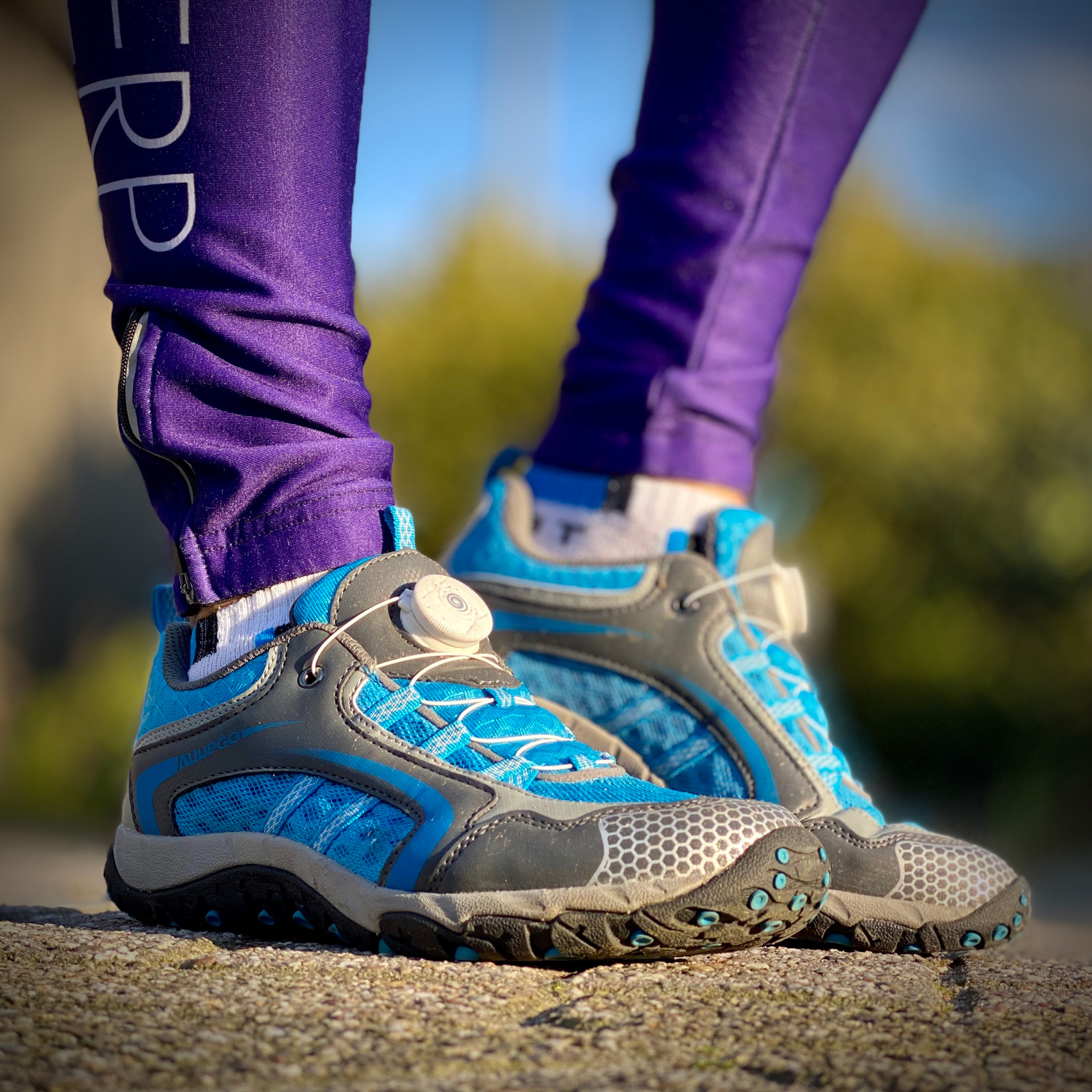
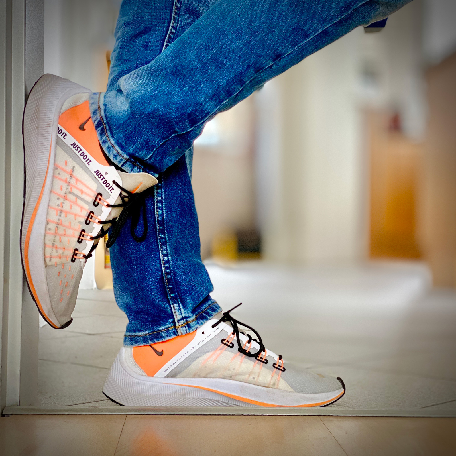
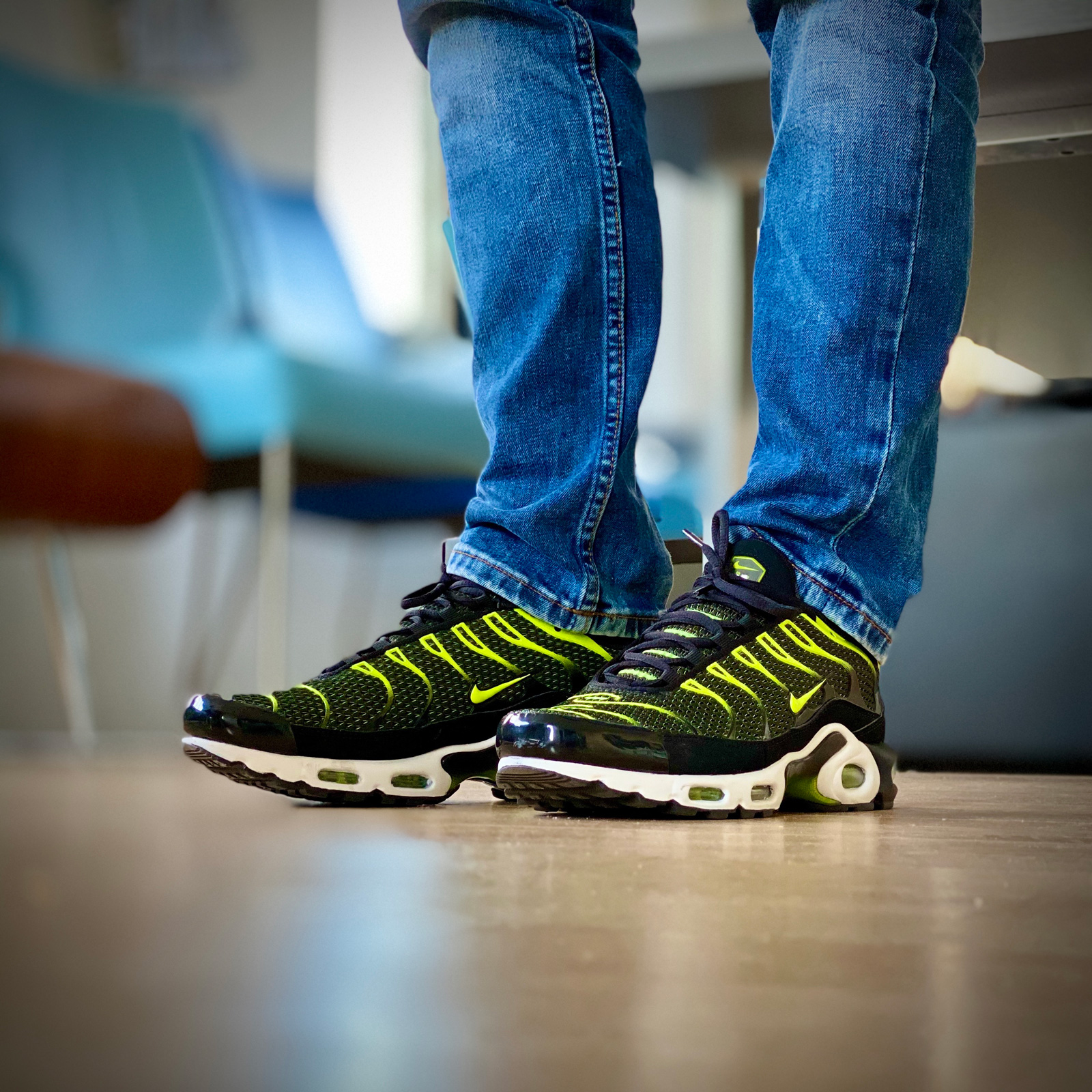
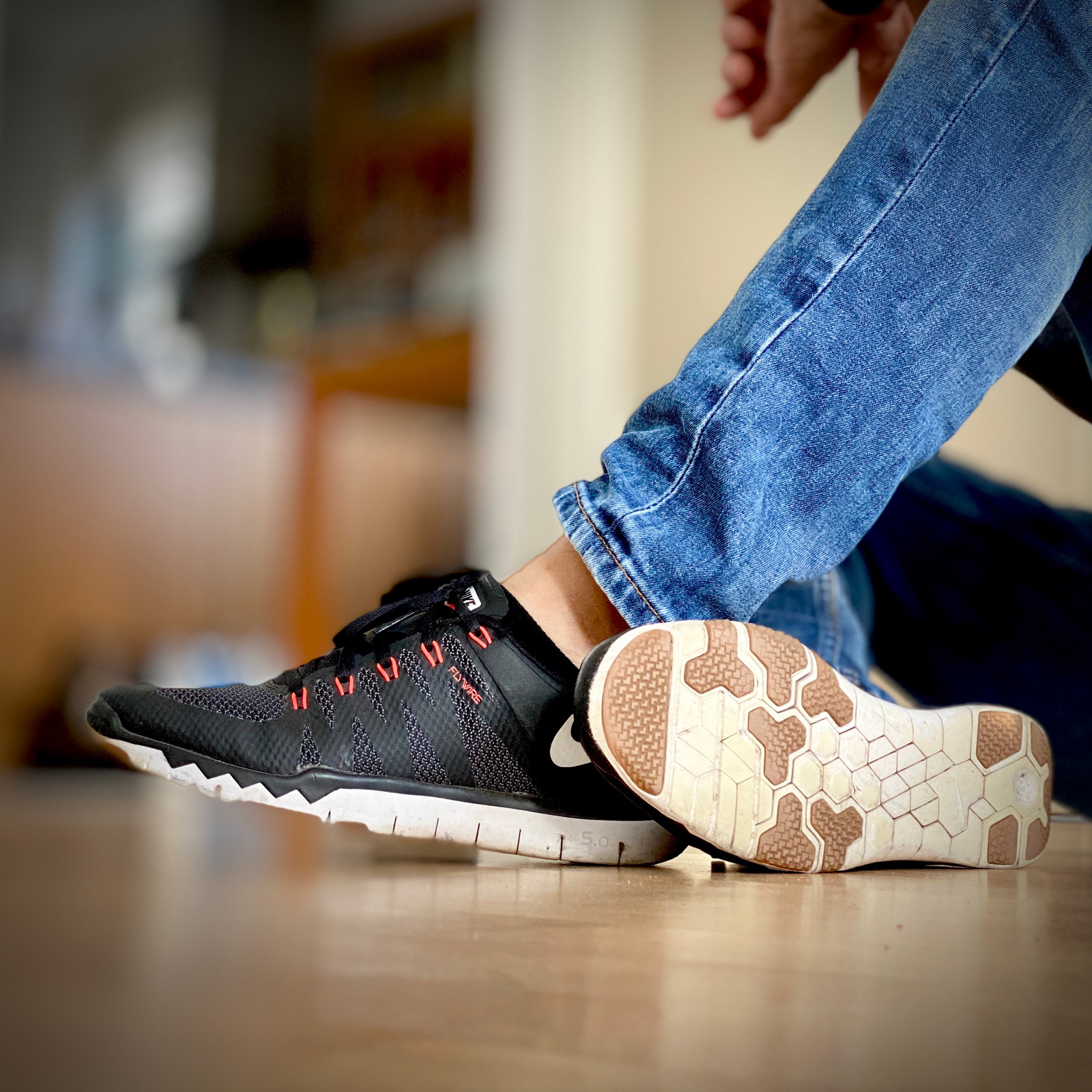
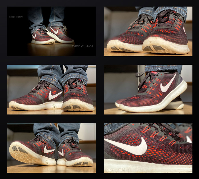
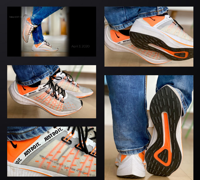
The past few days I changed the proportions of the pictures. All pictures are in the 16×9 ratio, but I left that for two reasons. The most obvious one is that some pictures have a lot of ‘nothing’ on it. And a second reason is the overview page of each sneaker with the thumbnails. Instead of a grid, it is now a nice masonry lay-out. I will keep the primary picture 16×9 with the black background to keep the same overview style.
And there was light
The second change coming along is the picture style. All primary pictures will no longer have the stage light effect where the sneakers are placed in the spotlight. Sure, the sneakers remain in the spotlight, but I will try to keep the background some lighter. Moreover, I will try not to forget to throw in some more background. Unsharp, to keep the focus on the sneakers of course.
